 Save 10% off your first LabelValue order |
 What's clear space? How should I use it for my business branding?
- May 31, 2016
If you're a small business owner or marketer who is handling graphic design duties for your company, this article is for you.
By putting certain guidelines in place, you can become exponentially more efficient and productive at producing quality graphics for your company.
Adding a definition of clear space to your logo is one such standard of blank space branding. Defining logo clear space will save you a ton of time and help ensure that your logo is displayed correctly at all times.
What is logo clear space?
Clear space is the term for a specific amount of space that a logo must have on all sides, no matter where it is used. The reason for clear space is to ensure that a logo maximizes visibility and impact.
How do I determine the right amount of clear space?
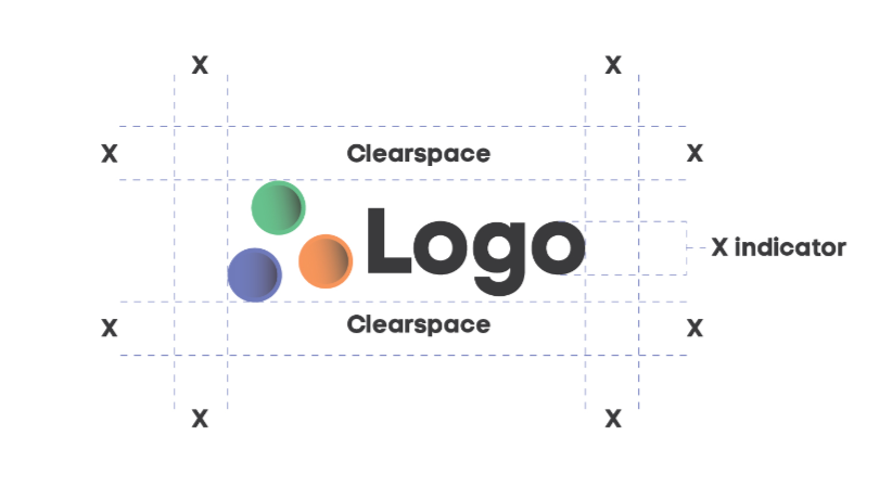
Choosing the right amount of logo clear space is very easy to do. In your logo, pick an element that is a standard or base size in your design. In the example to the right, the standardized element is the "O" in "Logo". Everything else in the design extends outwards from the size of the "O" - e.g. the lower part of the "g" and upper part of the "L" extend from the base unit of the "O".
This base element that you select is called the X indicator.
Once you have decided on your X indicator, measure out from the top and bottom of the X indicator. This dimension will be the basis for your clear space area.
To set the area of clear space around your logo, measure exactly one X indicator unit from the farthest vertical and horizontal points of your logo.
In our example, the furthest point on the left and to the bottom of our logo is the edge of the blue circle.
The furthest point to the right of the logo is the edge of the "O", and the furthest point to the top of the logo is the edge of the green circle.
We then measure exactly one X indicator unit from each of those points to establish our area of clear space.
Clear space examples
Here are a few correct and incorrect uses of logo clear space.
First off, we have an example where the logo is surrounded by graphic elements or images. On the left, the clear space is appropriately utilized, as the graphics fall outside the clear space area.
In the example to the right, the circles are encroaching too close to the logo. They violate the clear space needed for the logo.


In the following examples, we use clear space to determine where the text can begin after the logo.
In the left-hand example, the text is appropriately positioned outside of the clear space. In the right-hand example, the text is far too close to the logo, violating the clear space needed.

Why does logo clear space matter?
Any good designer will tell you that one of the most common mistakes in design is clutter.
Cluttered designs distract your audience from everything that the design contains.
Especially in the case of a logo, you want your brand to be recognized. Your logo is what connects with customers and it is the #1 item that they will associate with your brand.
If your logo is used in cluttered, sloppy and messy ways, your audience will anticipate that your company is also cluttered, sloppy and messy.
That's why having an understanding of logo clear space is really beneficial to blank space branding.
It also makes it very easy to decide how exactly to place your logo in different situations and across different media.
Introducing the design standard of clear space into your logo will really help clean up your designs across the board. From your website to business cards to your product labels and packaging, the design element of logo clear space is an oft-overlooked, yet crucial concept to get correct.
Interested in professional design for your custom labels? Read more about our custom label design services here.