Everything You Should Know Before Choosing A Color Pallete For Your Brand & Product Labels
- Dec 6, 2018
A good color palette is one that burns itself into your mind. So that even when you close your eyes it’s there, lingering like phosphenes or the memory of an ex-lover.
Make custom labels online!
Your brand deserves this sort of recognition. It can be difficult, though, to arrange a color palette that will resonate with customers. In this article, we’ll take a look at a few things that you should consider when choosing a color palette for your brand and how to keep it consistent across all of your branded materials and online custom labels.
Assumptions About Color
Now, I am sure that at this point, you’ve heard that specific colors can be linked to specific states of emotional arousal. This is generally called color psychology.
Red, for example, is associated with impassioned expression. That may be rage, love, or warning. The color blue is linked to the feelings of calm, and tranquility. These kinds of assumptions, though, can lead you into messy territory. 
The reason being that color theory is a lot more nuanced and complex than that. Blue is, too, associated with sadness. Ambiguities or discrepancies in the meaning of a particular color are to be expected. They are, after all, just light waves.
They don’t hold the great amount of the psychic energy that we like to ascribe to them. I mean, think about it. What are we to do with colors that resist an immediate identification of their evocative powers?
Colors like orange, burgundy, gamboge, wenge, amaranth. (No, I didn’t just make those last three up, even though it feels like I did.) It is estimated that the human eye can see several million different colors. If we were turned by every single color and hue we encountered in our daily lives, we would probably go insane from all the stimuli.
Brand Color and Culture

The social and environmental context you find yourself in and identify with are what make up your culture. That culture influences your assumptions. When it comes to assumptions regarding color, the same is true.
Research published on Britannica Academic suggested as much when it found that children in the western world developed the same inclination as they got older. A tendency to equate black with mourning. This was learned behavior, as black in other societies has different connotations. (White, gold, and purple are used for mourning in some other countries.)
Some people, because of this, develop an aversion to black and tie to it many weighty, and sometimes negative, associations. Further, as children get older they tend to gravitate toward specific hues, rather than a specific color.
This doesn’t mean that they don’t have a color they consider as their favorite. It just means that they will not settle for any old hue of that color. So while blue may be their favorite color, they may opt for a shade of another color, if that shade of blue is not to their liking.
The practices and gender norms we engage with and are taught can also influence our concept of color and culture.
In 2003, Joe Hallock conducted a study on color assignment. Of the 232 participants surveyed, the majority of both men and women cited their favorite color as blue.
There is evidence to suggest, though, that humans couldn’t even see blue until 6,000 years ago. Maybe it was then, that we finally leveled up enough to be worthy of the calm it provides, but seeing as society grows more and more hectic by the day, probably not.
When it came to their second favorite color, the results were more divergent. Green was discovered to be the second most popular color among these men.
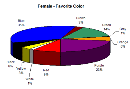
For the women involved in the survey, that color was purple. Green was the third most popular color among the women. None of the men cited purple as their favorite color.
The color orange was regarded as the least favorite color for both men and women in the survey. When asked to describe the color, participants chose the words “fun, warm, jovial, lively, energetic, exuberance,” and for some reason, “hilarity.”
This presents an interesting conundrum. How can a color regarded as the least favorite by both groups be ascribed such positive attributes? Well, some believe that the prevalent dislike of the color orange is more a result of the stylistic choices of the times.
It seems, orange was simply out of style at the time of the survey. This shows us that the associations and appeal of a color are dependent on more than any inherent characteristics of the color itself.
So where does this leave you when choosing colors for your brand and product labels?
Consider the Idea Behind the Brand's Colors
Based on what we just discussed, should you just throw away everything you know about color associations? Not quite, but you should keep in mind that these colors have no emotive power outside of a clear and defined context.
In the creation of your color palette, then, you want to create something that speaks to the philosophy, or personality of your brand. To do that, you must understand your brand.
Color stereotypes will only work in specific socio-cultural and brand contexts. You must know the context in which your colors are to be interpreted. Essentially, what you wish for them to represent as an extension of your brand.
Starbucks, for example, is well known for its iconic green and white palette. That wasn't always the case. In 1971, at their inception, the company chose brown to represent coffee. The palette wasn't changed until 1987, when Howard Schultz became the CEO. He decided upon the color green because he felt it would represent the freshness, growth and one of a kind property of their brand and selection of brews.
So don’t fret, people will learn to associate a particular set of colors with your brand. If you wish to use color stereotypes to your advantage then make sure you are mindful of the context they will exist in, and the personality you wish to convey when choosing a color palette for your brand.
With that knowledge, you are now prepared to select some colors to represent your brand.
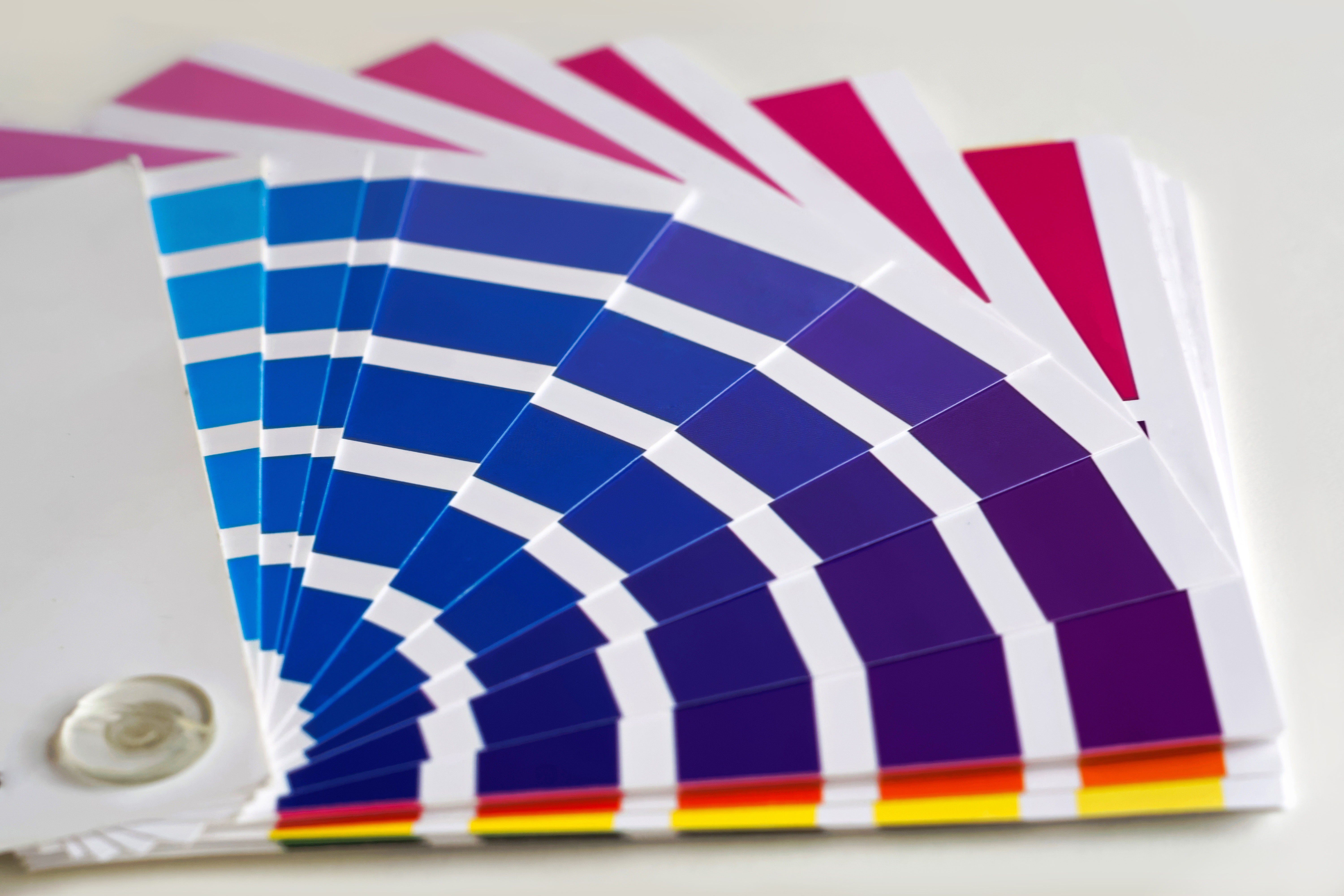
Arranging the Color Palette

So you’ve got a few colors in mind. The next question is how best to organize them? Well, one psychological principle may have the answer. It’s called the Isolation Effect, and it dictates that an image is more readily burned into the mind of an observer when it is presented in contrast to the things around it.
The sore-thumb effect, if you will. Studies indicate that many people quite enjoy analogous color palettes. The color palettes that stick with them, however, are the ones that incorporate analogous colors as well as triadic, or accent, colors.
Remember; the look and feel of your brand is up to you. It needn’t be dictated by cultural norms. It’s okay to use these stereotypes for your own advantage, but don’t fool yourself into thinking the color alone will do the talking.
Your color palette can only reinforce the image of your brand. It cannot create the image on its own. The color scheme will also communicate different things depending on the context in which its viewed. You have some control over that context, when you establish the ethos of your brand. So, now you’re prepared to choose a color palette for your brand. Be sure to focus on establishing the identity and ethos of your brand so as to influence the context in which those colors are interpreted.
Thanks for reading.
After you’ve chosen your color palette, you’ll likely need some custom printed labels to put on your products to show off the great colors you’ve chosen. We’d love to help.
If you’re looking to get custom labels made, consider giving LabelValue a try. You can get started on a free label quote here. Or you can dial (800) 750-7764 to speak with a representative. LabelValue is open Monday through Friday.