11 Creative Coffee Label Designs You Need to See For Yourself
These are 11 creative coffee label ideas from around the web that we think are completely off-the-charts awesome.
Below you can browse through and find our comments about each creative coffee label. We hope you find some inspiration as you design or redesign your own custom coffee labels.
*Note: We do not own any of these labels or images. We did not print/manufacture any of these labels. This is intended solely as a collection of amazing designs for design inspiration. If you own any of these images and would like them to be removed, please contact us at service@labelvalue.com. Enjoy!
1. Handsome Coffee Roasters:

What We Like: The diamond-orientation of this square label is genius. The diamond-shape allows the color at the top of the label to really pop and complements the overall packaging nicely. The matte paper finish adds a rustic touch to the label which is also excellent.
2. Grady's Cold Brew:

What We Like: The typography. Generally speaking, we recommend customers veer away from using too many font choices in their designs, as it typically leads to busy, disjointed designs. On this label, however, it is executed perfectly and really gives this cool coffee label a fantastic style.
3. Velocita:

What We Like: The focus and goal of the packaging. The company is trying to express how fresh their coffee is and how better to do this than to make it seem like the coffee was shipped directly from the fields to your home. The mash-up of hand placed stickers and stamps, along with the shipping label and the packing tape just works together nicely.
4. DD Coffee Hand Lotion:

What We Like: The classic apothecary style look and feel of this label. A coffee-flavored hand lotion is perfectly represented with this masculine, clean-lined label. The simplicity and the hand-drawn variable data go hand-in-hand.
5. EOS Fair Trade Coffee:
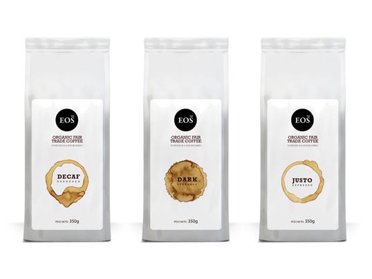
What We Like: The simplicity. The simple white/black color scheme allows the coffee stain in the center of the label to really jump. Nice use of colors and spacing here.
6. Stumptown Coffee Roasters:

What We Like: The intrigue created by the inserted cards. By not displaying all of the information, this cool coffee label idea creates intrigue that ideally will cause the customer to pull the card out and read. This is a neat idea that is executed wonderfully here.
7. Fuel Coffee:

What We Like: The full-package label and contrast. By using such strong contrasting colors but keeping the majority of the label the same, these coffee products really pop.
8. Prince St. Cafe:

What We Like: This is a perfect example of how to incorporate variable data into a cohesive packaging design. By printing the variable labels on demand and placing them at the bottom, the brand maintains a consistent look, which is always a good thing.
9. No. Six Depot:

What We Like: The smooth look of this cool coffee label idea. The unique packaging calls for a smooth, clean looking label. No. Six Depot accomplishes this perfectly with this design which uses clean, simple lines, colors and typography.
10. Owl's Brew:

What We Like: The matte, chalkboard-like material. This creative coffee label design is smooth and rustic with a nice chalkboard looking matte material and simple white print. All in all, the simplicity is very classy and inviting.
11. Il Barista:

What We Like: The consistency. We love the way that this brand incorporated their look and feel across their different product lines. It helps the customer associate that brand with their diverse product line. This is an excellent example for anyone looking for K-cup labels as well as traditional coffee product packaging.
And there you have it. If you've been inspired by these coffee label designs and are ready to move forward with your own custom label design idea, don't hesitate to contact one of our custom label experts today at 800-750-7764.