 Save 10% off your first LabelValue order |
 The Benefits of Logo Versatility: how to design a great logo for all of your labels & marketing materials
- Jun 14, 2016
Oftentimes when we receive artwork for custom labels, we notice that brand's pigeon-hole themselves into a conflicted design or confusing color scheme in order to retain their original logo's characteristics. Need graphic design help? Hire a custom label graphic designer!
So we've put together this post, with help from our graphic design/pre-press department, outlining what logo versatility is and how it can help you when designing your custom labels. This isn't limited to just labeling, however. Having great logo versatility can aid you in digital media and in other forms of print as well.
We'll start with an example of the different ways that we can use the LabelValue.com logo:![]()
As you can see, our logo's versatility lies mainly in the color scheme. This is the first aspect of logo versatility that we will discuss.
1. A Logo with Color Options
If you have a main logo with multiple colors, one of the most troublesome things you will encounter is incorporating your logo into different color schemes for different projects. Invariably, if your business is being mentioned in the press, by a website or in sponsorship materials, there will be times that your logo's colors conflict with the design.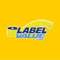
For instance, this dark yellow-orange color could be an example of a magazine's main color that we are being featured in.
Our logo clashes pretty badly with this and has really low contrast, both of which convey poor branding. Granted, this is a very difficult color to look good with, but it's a situation we realistically could encounter.
So having a logo with multiple color versions can help us overcome this hurdle.
If we use our dark blue logo version instead, we get a strong contrast that compliments our logo well.
2. A Logo with a Simplified Version
Many brands have pretty busy full-version logos. This can make it quite complicated to work around, especially when designing labels or packaging.
Another example of useful logo versatility is having a simplified version of your logo. An example of this is Fuddrucker's restaurant's logo.![]()
The full version of this logo is quite complex, with a lot of colors, angles, and shapes. This is very unique and looks great on the restaurant's signs and many other materials, but in some cases, it is just too much.![]()
So Fuddruckers created a simplified version of their logo to use in other cases. It maintains the trademark yellow and red stroked text, the curvature, and the banner background, making it easily identifiable.
However, it is much easier to apply across a wider variety of media.
Maintaining your branding is key
No matter how you choose to create your versatile logo, it's essential that the unique characteristics of your logo design are carried throughout the different variations.
You want to make sure that people recognize your brand without having to think about it. Oftentimes having alternate versions of your logo can actually enhance this recognition for your consumers, as it creates less distracting marketing materials.
Especially when you are printing custom labels and choosing packaging for a varied product line, you will oftentimes find that you need the flexibility of having reversed logos or single-color logos to fit with the product label design.
Do you need help creating variations of your logo for your label design? We offer expert in-house graphic design services with designers who are experienced in creating flexible logos that work perfectly with your product's label design.
Learn more about our design services here or give us a call at 800-750-7764.